Your wedding colour palette sets the entire tone for your celebration. It influences everything from your floral arrangements and bridesmaid dresses to table linens, stationery, and even your cake design. Yet many couples feel overwhelmed when faced with seemingly endless colour combinations and design possibilities.
At Florals of Splendour, we’ve helped countless couples navigate colour selection, creating cohesive, beautiful wedding aesthetics that feel authentically theirs. The right colour palette doesn’t just look beautiful—it reflects your personalities, enhances your venue, and creates the atmosphere you want your guests to experience.
This comprehensive guide will walk you through choosing a wedding colour palette that’s stunning, practical, and perfectly you.
Understanding Colour Psychology in Weddings
Colours evoke emotions and set atmospheric tones. Understanding colour psychology helps you choose palettes that create the feelings you want for your celebration:
Romantic and Soft: Blush pinks, soft peaches, ivory, champagne, and dusty rose create gentle, romantic atmospheres perfect for traditional or garden weddings.
Elegant and Sophisticated: Navy, burgundy, emerald, gold, and deep jewel tones convey luxury and timeless elegance, ideal for formal celebrations.
Fresh and Cheerful: Yellows, corals, bright pinks, and turquoise bring energy and joy, perfect for summer celebrations or couples wanting vibrant atmospheres.
Calm and Serene: Soft blues, sage greens, lavender, and grey create peaceful, contemplative environments suited to intimate ceremonies.
Bold and Modern: Deep blacks, crisp whites with metallic accents, or unexpected colour combinations make contemporary statements.
Natural and Organic: Earth tones, terracotta, olive greens, and warm neutrals connect to nature and suit outdoor or rustic venues.
Consider what emotions you want to evoke when guests enter your celebration space. Your colour palette becomes a visual language communicating your wedding’s essence before anyone speaks a word.
Starting with Inspiration
Finding your colour palette begins with gathering inspiration. Here are effective starting points:
Your Venue: Many couples choose colours that complement their venue’s existing palette. Historic stone buildings might inspire earth tones and greenery. Beachside locations might suggest blues and sandy neutrals. Modern spaces might call for bold, contemporary palettes.
Seasonal Influences: Spring weddings naturally suit pastels and fresh greens. Summer invites bright, vibrant colours. Autumn embraces rich oranges, burgundies, and golds. Winter celebrates deep jewel tones, metallics, and crisp whites.
Personal Favourites: Start with colours you genuinely love. If you’ve always adored deep purple or feel happiest in sage green, incorporate these into your palette.
Fashion and Design Trends: Whilst you want timeless appeal, current design trends can inspire fresh, contemporary palettes that feel current without being dated.
Meaningful Connections: Perhaps you met in a lavender field, share love for the ocean, or have favourite flowers in specific colours. These personal connections create meaningful palettes.
Cultural Traditions: Many cultures associate specific colours with celebrations, luck, or important symbolism. Honouring these traditions adds depth to your choices.
Create mood boards—digital or physical—collecting images that resonate with you. Pinterest, Instagram, and wedding magazines offer endless inspiration. Notice which colour combinations appear repeatedly in your saved images. This reveals your natural aesthetic preferences.
The Rule of Three (Plus Neutrals)
Professional designers typically work with three main colours plus neutrals. This formula creates visual interest without overwhelming cohesion:
Your Dominant Colour: This appears most frequently throughout your wedding—approximately 60% of your colour usage. It might be your bridesmaid dress colour, primary floral choice, or main décor element.
Your Secondary Colour: This complements your dominant colour and appears in about 30% of your design elements. It adds depth and visual interest whilst supporting your main colour.
Your Accent Colour: Used sparingly (about 10%), accent colours provide pops of contrast and excitement. They might appear in bouquet ribbons, table runners, or invitation details.
Neutrals: White, ivory, cream, beige, grey, or taupe serve as foundations, allowing your colours to shine whilst providing visual rest. Neutrals appear in table linens, candles, or background elements.
For example, a romantic palette might feature blush pink (dominant), dusty sage (secondary), gold (accent), plus ivory neutrals. A modern palette might use navy (dominant), burgundy (secondary), copper (accent), plus grey neutrals.
This formula ensures your palette feels intentional and professionally designed rather than chaotic or overwhelming.
Considering Your Venue’s Existing Palette
Your venue significantly influences colour choices. Work with, not against, existing architectural colours and design elements:
Complementary Colours: Choose wedding colours that harmonise with venue tones. If your venue features warm wood tones, earth-inspired palettes work beautifully. Cool stone architecture suits jewel tones or crisp modern palettes.
Contrast Strategies: Sometimes contrast creates drama. Deep colours pop against white venues. Soft pastels create ethereal effects in darker spaces.
Enhancement Rather Than Competition: Your colours should enhance your venue’s beauty, not compete with it. If your venue is already visually busy, simpler palettes prevent sensory overload.
Seasonal Venue Changes: Consider how your venue looks during your wedding season. Gardens change dramatically from spring to autumn. Indoor venues might adjust lighting or décor seasonally.
Visit your venue at the same time of day as your wedding to see natural lighting effects on colours. Colours that look beautiful in afternoon sun might appear different under evening artificial lighting.
At Florals of Splendour, we often conduct venue consultations, helping couples understand how their colour choices will interact with their celebration space, ensuring harmonious, beautiful results.
Seasonal Colour Palette Ideas
Each season offers unique colour opportunities:
Spring Wedding Palettes:
- Soft pastels: blush, lavender, mint, and butter yellow
- Fresh combinations: coral, peach, sage, and cream
- Classic spring: soft pink, lilac, and fresh greenery
- Modern spring: lemon yellow, grey, and white
Summer Wedding Palettes:
- Vibrant tropicals: fuchsia, orange, turquoise, and gold
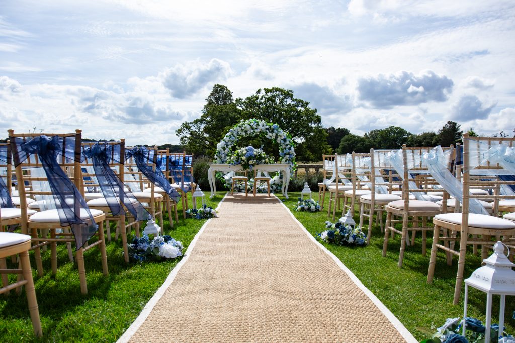
- Coastal elegance: navy, coral, sandy beige, and white
- Garden party: bright pink, yellow, purple, and green
- Sophisticated summer: emerald, blush, and champagne
Autumn Wedding Palettes:
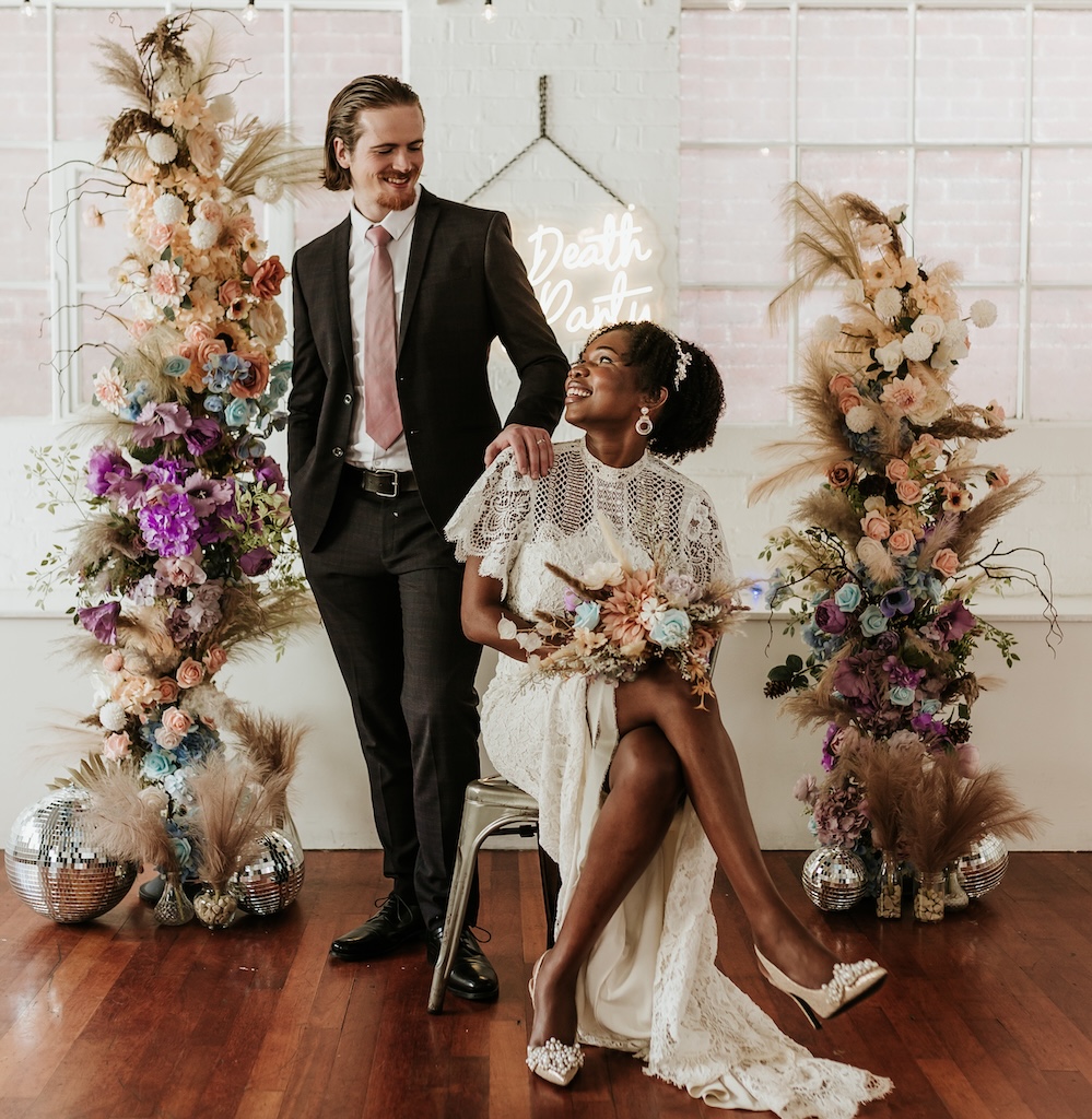
- Harvest warmth: burgundy, orange, mustard, and brown
- Jewel-toned richness: plum, emerald, gold, and navy
- Rustic elegance: terracotta, sage, copper, and cream
- Modern autumn: rust, charcoal, blush, and ivory
Winter Wedding Palettes:
- Classic winter: deep red, forest green, gold, and white
- Icy elegance: silver, white, dusty blue, and grey
- Dramatic luxury: black, burgundy, gold, and ivory
- Romantic winter: plum, mauve, silver, and cream
These seasonal palettes provide starting points, but remember—with luxury artificial flowers from Florals of Splendour, you’re not limited by seasonal availability. Want peonies in December or autumn foliage in June? We can make it happen whilst maintaining seasonal appropriateness in your overall palette.
Testing Your Colour Combinations
Before committing fully, test your colour palette:
Create Physical Samples: Gather fabric swatches, paint chips, ribbon samples, and flower photographs in your chosen colours. Arrange them together to see how they interact.
Consider Different Lighting: View your samples in natural daylight, indoor lighting, and evening conditions. Colours shift dramatically under different light sources.
Photograph Your Samples: Take photos to see how colours appear on camera. Your wedding will be extensively photographed—colours should look beautiful in images.
Scale Considerations: Small colour samples might look different when used in large quantities. A bold colour might overwhelm when used for all bridesmaid dresses but work perfectly as an accent.
Consult Professionals: Share your palette with your florist, planner, and other vendors. Experienced professionals can identify potential issues or suggest refinements.
Trust Your Instincts: If something feels off, listen to that instinct. Your colour palette should excite you, not create doubt.
This testing phase prevents expensive mistakes and ensures you’re truly happy with your choices before making major purchases or commitments.
Coordinating Colours Across Wedding Elements
Once you’ve chosen your palette, apply it consistently across all wedding elements:
Invitations and Stationery: Your colour palette’s first introduction to guests. Use it throughout save-the-dates, invitations, programmes, and signage.
Attire: Bridesmaid dresses, groomsmen accessories, flower girl outfits, and even your own accessories can incorporate wedding colours.
Florals: Your palette directly influences floral choices. Work with your florist to select blooms in your colours, or with artificial flowers, achieve exact colour matching.
Ceremony Décor: Aisle runners, ceremony backdrops, pew decorations, and altar arrangements all reflect your palette.
Reception Details: Table linens, napkins, chargers, glassware, and chair covers carry your colours through reception spaces.
Centrepieces and Tablescapes: Floral arrangements, candles, and table décor heavily feature your colour choices.
Cake and Desserts: Wedding cakes, dessert tables, and even signature cocktails can incorporate your palette.
Lighting: Coloured uplighting or ambient lighting reinforces your colour scheme throughout the venue.
Favours and Details: Small touches like favour boxes, escort cards, and guest book areas complete your cohesive design.
At Florals of Splendour, we help coordinate all these elements, ensuring your colour palette flows seamlessly throughout your entire celebration, creating that polished, professionally designed aesthetic.
Common Colour Palette Mistakes to Avoid
Learning from others’ experiences helps you sidestep common pitfalls:
Too Many Colours: More isn’t better. Stick to your three colours plus neutrals formula. Excessive colours create visual chaos rather than cohesion.
Ignoring Undertones: Colours have warm or cool undertones. Mixing warm and cool versions of the same colour (like cool grey with warm beige) can look muddy rather than intentional.
Forgetting About Skin Tones: Consider how your colours look against various skin tones, especially for bridal party attire. Some colours flatter everyone; others are more selective.
Overlooking Colour Saturation: Using only highly saturated, bold colours overwhelms. Balance bright colours with softer tones or neutrals.
Neglecting Photography: Remember that colours photograph differently than they appear to the eye. What looks perfect in person might appear different in images.
Seasonal Disconnection: Heavy, dark palettes can feel oppressive at summer outdoor weddings. Light pastels might look washed out at dramatic winter venues.
Poor Contrast: Ensure sufficient contrast between colours and backgrounds. Pale colours on white backgrounds disappear; dark colours on dark backgrounds lack definition.
Trend Chasing: Whilst incorporating current trends is fine, ensure your palette feels authentic to you. You’ll look at these photos for decades.
Working with experienced designers helps avoid these mistakes, ensuring your colour palette enhances rather than detracts from your celebration’s beauty.
Making Bold Colour Choices Work
If you love bold, unconventional colours, here’s how to use them successfully:
Balance with Neutrals: Bold colours need neutral breathing room. Pair vibrant choices with plenty of white, cream, or grey.
Strategic Placement: Use bold colours in specific areas—accent walls, signature cocktails, or statement floral installations—rather than everywhere.
Quality Materials: Bold colours in cheap materials look garish. In luxury fabrics, quality florals, and premium finishes, they look sophisticated.
Confidence in Execution: Bold palettes require confident, intentional design. Half-hearted bold choices look accidental; fully committed bold palettes look stunning.
Consider Guest Comfort: Very bold, vibrant palettes can be visually exhausting over long celebrations. Balance energy with calming elements.
Professional Guidance: Bold palettes benefit enormously from professional design guidance. Experienced stylists know how to make dramatic choices feel elegant.
At Florals of Splendour, we love working with couples who want to push colour boundaries. Our expertise ensures bold palettes feel sophisticated and intentional rather than overwhelming.
Working with Your Florist on Colour
Your florist plays a crucial role in bringing your colour palette to life:
Exact Colour Matching: With luxury artificial flowers, we can achieve precise colour matching impossible with fresh florals. If you need exact bridesmaid dress colour in your bouquet, artificial flowers deliver.
Seasonal Flexibility: Artificial arrangements eliminate seasonal limitations. Your perfect palette isn’t restricted by what’s currently blooming.
Consistent Colour: Fresh flowers vary in colour even within the same variety. Artificial flowers ensure consistent, reliable colour throughout all arrangements.
Long-Lasting Beauty: Colours in artificial flowers won’t fade, brown, or change throughout your wedding day, ensuring consistent beauty from ceremony through final dance.
Texture and Tone: Discuss colour depth, saturation, and undertones with your florist. These details ensure floral colours perfectly match your vision.
Lighting Considerations: Professional florists understand how different lighting affects floral colours and adjust choices accordingly.
At Florals of Splendour, we specialise in creating bespoke artificial arrangements in your exact colour palette, ensuring your florals perfectly support your overall wedding design.
Your Perfect Palette Awaits
Choosing your wedding colour palette is one of the most creative, enjoyable parts of wedding planning. It’s an opportunity to express yourselves, create beauty, and design an atmosphere that reflects your love story.
Whether you’re drawn to soft, romantic pastels, bold contemporary combinations, classic elegant tones, or something entirely unique, the right palette exists for your celebration. The key is understanding colour principles, considering practical factors, and working with experienced professionals who can bring your vision to life beautifully.
Ready to Bring Your Colour Vision to Life?
At Florals of Splendour, we transform colour palettes into stunning reality through bespoke floral arrangements, elegant event styling, and comprehensive design coordination. Let’s create a wedding that’s as beautifully cohesive as it is uniquely yours.
Book your free consultation today and discover how our expertise in colour, design, and luxury styling can make your wedding dreams come true.
We proudly serve couples across Essex, London, Hertfordshire, Cambridgeshire, Kent, Suffolk, Surrey, and surrounding areas.
Your beautifully coordinated celebration starts here.
Book Your Free Consultation | Call Us: 07727 090208 | WhatsApp Us
Frequently Asked Questions
Q1: Should my wedding colours match current trends, or should I choose timeless options?
The best approach balances both. While you want your wedding to feel current and fresh, choosing a palette you genuinely love ensures your photos remain beautiful to you decades later. We recommend using timeless base colours with trendy accents. For instance, classic navy and gold never go out of style, but you might incorporate currently trendy dusty blue as an accent. Avoidpalettes chosen solely because they’re “on trend”—if you don’t love the colours independently, you won’t love them in your wedding photos years from now. At Florals of Splendour, we help couples identify palettes that feel both contemporary and personally meaningful, ensuring your celebration feels current without being dated.
Q2: How many colours are too many for a wedding palette?
Generally, limit yourself to three main colours plus neutrals (white, cream, beige, grey). This creates visual interest without overwhelming cohesion. Using five, six, or more distinct colours typically results in chaotic, disjointed aesthetics that lack sophistication. However, you can include various tones and shades within your chosen colours—for example, using blush, rose, and mauve all counts as variations of pink rather than three separate colours. The exception might be rainbow or bohemian-themed weddings where colour variety is intentional and carefully executed. For most couples, the three-plus-neutrals formula delivers professionally designed results that photograph beautifully and feel cohesive throughout your celebration.
Q3: What if my partner and I like completely different colours?
This is common and absolutely solvable! Start by identifying what you each love about your preferred colours—is it the vibrancy, the calmness, the elegance? Often, you can find middle-ground palettes that capture what you both want. One partner might love bold red whilst the other prefers soft pink—perhaps burgundy and blush together satisfy both preferences. You can also assign colours to different elements—one colour dominates ceremony styling whilst the other features prominently in reception décor. Consider working with a professional stylist who can help you visualise compromises and find palettes you both love. At Florals of Splendour, we frequently help couples navigate colour disagreements, finding creative solutions that honour both partners’ preferences whilst creating cohesive, beautiful results.
Q4: Can I use artificial flowers to achieve colours that aren’t available in fresh flowers?
Absolutely! This is one of the biggest advantages of luxury artificial flowers. Fresh flowers are limited to nature’s colour palette and seasonal availability. With premium artificial flowers from Florals of Splendour, you can achieve virtually any colour imaginable, including exact matches to bridesmaid dresses, specific Pantone colours, or unique custom shades. Want navy blue flowers, grey roses, or peach orchids that don’t exist in nature? Artificial florals make it possible. This colour flexibility allows you to design your perfect palette without compromise, ensuring every element coordinates exactly as you envision. You’re not limited by what’s blooming seasonally or naturally available—your imagination guides your choices.
Q5: How do I ensure my wedding colours look good in photographs?
Consider several factors when choosing photography-friendly colours. First, ensure sufficient contrast—pale colours on white backgrounds or dark colours on dark backgrounds lack definition in photos. Second, test your colours in various lighting conditions and photograph them, as colours often appear different on camera than to the eye. Third, avoid highly saturated neon colours that can cause colour bleeding or distortion in images. Fourth, communicate your colour palette to your photographer during planning meetings so they can adjust white balance and settings accordingly. Finally, consider that certain colour combinations photograph better than others—photographers often love jewel tones, neutrals with metallic accents, and classic combinations that provide visual interest without overwhelming. At Florals of Splendour, we design with photography in mind, ensuring your colour choices translate beautifully into the images you’ll treasure forever.
Florals of Splendour creates cohesive, beautifully coordinated wedding styling across Essex, London, Hertfordshire, and beyond. Let our expertise in colour and design bring your vision to life.